Client Name
M&D
Project Details
Branding / Web Design / Development / eCommerce
Technology
HTML5 / CSS3 / JavaScript / PHP / SQL / Stripe / GSAP / Swup
Idea
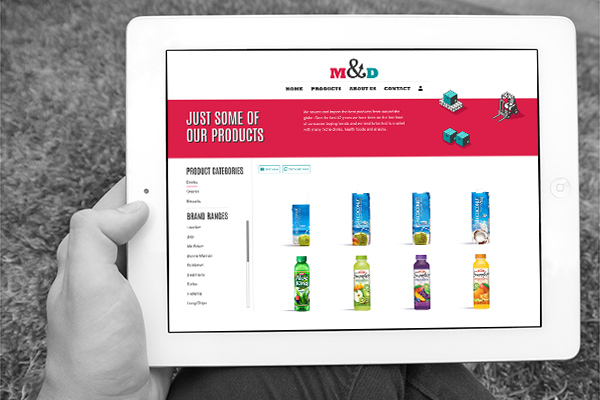
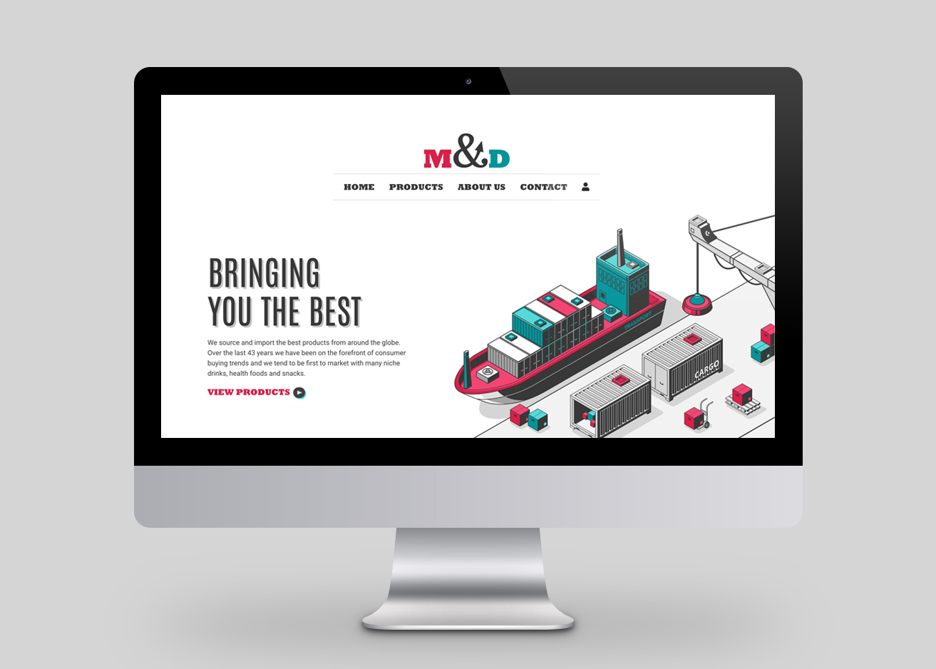
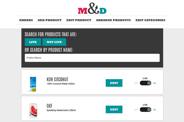
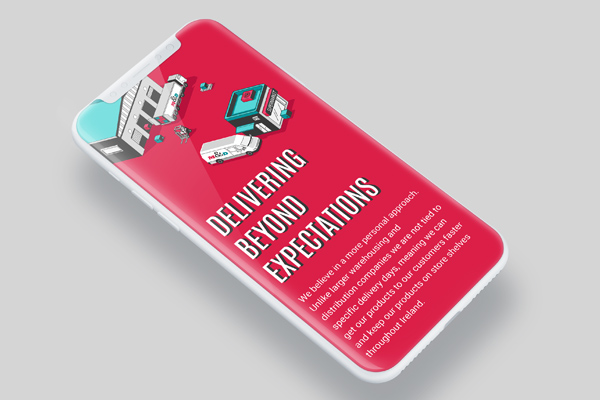
Well established Irish food and beverage company M&D was in need of a long overdue rebrand. The company, which has been in operation for over 40 years, required a new logo, colour palette and a more modern approach to better fall inline with the array of stylish food and beverage companies they represent. Together with the client we decided the new look and feel of M&D should be modern and playful, however, I also wanted the logo to evoke a feeling of dependability and be more representative of a company that has been going strong for over 40 years. I used classic serif fonts to achieve this. The colour palette gives the brand a playful touch, while animated illustrations throughout the website suggest a business that is constantly on the move. This was a large development project involving a custom made drag and drop CMS to power the eCommerce pages of the website and Stripe intergration. The entire CMS is designed to be as simple and intuitive to use as possible, with minimal end-user training required. A full CMS demo is available on request.
Full design package:
Logo design & branding
Web design & development
Drag & drop CMS
All copywritting
Want to see more?
Visit the website:
www.mandd.ie


